Community-oriented, heart-driven DESIGN.
I'm a product and systems designer, and a graphic designer. I passionately put my skills and heart into projects that contribute to community development, to a more sustainable and fulfilled life, into productivity and digital wellness initiatives.
Product & experience design
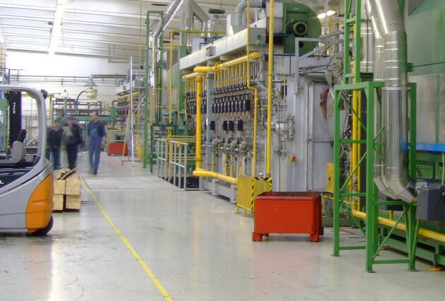
REDESIGN OF A FACTORY TOUR EXPERIENCE
Previously, factory tours involved almost 20 employees and had a huge impact on their schedules, as a lot of the activities had to be redone every time.Based on feedback from previous guides and understanding the needs of the clients, I designed a new work flow in order to have a single person responsible for hosting the tour, who was familiar with the speech, the path and objectives.This meant that it was a new user experience for the visitors, as well, by providing a standard tour every time.The whole process and flow was documented and could be easily implemented by new hires / replacements.
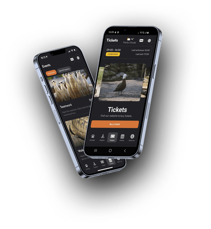
UX volunteer @ Hack4zoo
I participated in a hackathon aimed at creating an app for the local Zoo. I provided UX tips and improvements.
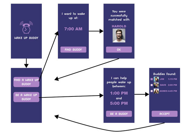
[concept] WAKE UP BUDDY
A project for the Product Design course at the Delft University of Technology.User research was focused on the morning routine. The design challenge was to help busy single adults get out of bed first thing, no snooze, so that they will feel more energized and happier.My idea was an app that connects people from different time zones in order to call each other and provide an inspiring wake up for the user. It provides a friendly way of waking up, adding human interaction to the experience.
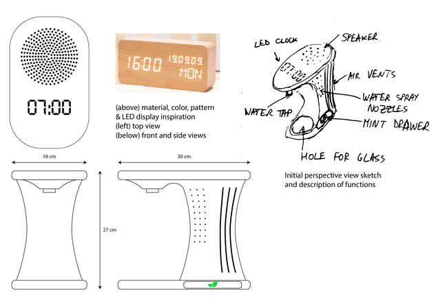
[concept] DIGITAL ALARM CLOCK WITH WATER DISPENSER
Project for the Product Design course at the Delft University of Technology.User research was focused on the morning routine. The design challenge was to help busy single adults get out of bed first thing, no snooze, so that they will feel more energized and happier.My concept was a smart digital alarm clock, which includes: mint tray, air flow, water spray (as options of waking up). It provides a glass of water for drinking in order to power up the body, offering a refreshing feeling (as per the initial user interviews).
Graphic design
LOGOS
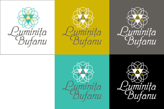
(top-left) Logo for my wife's project. She wanted to communicate wholeness, as well as the idea of healthy, plant-based foods. I especially love the contrast in font styles on her name.(top-right) I made this logo for my own business, providing counsel to individuals on decluttering their personal space and their homes, aiming to a minimalist lifestyle. The name means "honeycomb" in Romanian and for me it represented perfection in terms of space organization - bees having a neat and tidy hive.(center) Proposal for a visitor center in a factory. Chromatically it was inspired by the company's corporate branding and the dots being led by the square represent the visitors and tour guide.(bottom) Logo for a trainer and author, specialized in financial education. She wanted a feminine logo, displaying both her passion for Eastern philosophy, as well as abundance and wealth.
Guide for local authorities
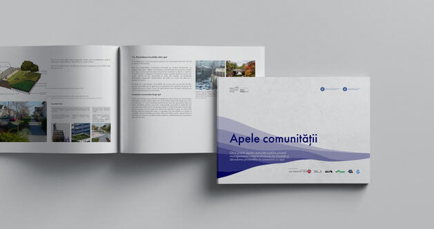
The guide's layout was started by one of the authors and my role was to revisit it, the texts, some of the graphics and photos, while also adding more content provided by the authors and through specialists' feedback, make it more easy to go through by a non-technical person, and provide a cover.The booklet showcases nature-based solutions regarding water course management to local authorities. It was very important to keep in mind the reader's profile while working on the content, layout and general flow of the guide.It was a good learning opportunity, as I went through dictionaries and legislation in order to have a clear understanding of the concepts, thus being able to convey them in a clear manner both in text and in graphics.
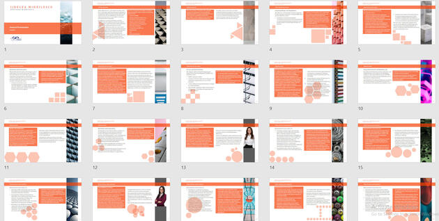
LAW FIRM PRESENTATION SLIDES
This law firm wanted to send their prospective clients a presentation encompassing their expertise and team of lawyers.In order to keep the reader engaged in going through the information, my proposal alternated black text on the white background with white text on a colored background (their corporate color). I inserted the element of surprise by moving, resizing and rearranging basic shapes on each slide.These were also an indication of the section of the presentation that the reader was in. Moreover, the photography used on the side went together with the graphics, displaying the same shapes.